
The ValueCharts(R) indicator generates similar values across the various trading platforms, but the look of the display of the indicator's results can vary substantially. This is primarily because of limitations with the graphics abilities across platforms.
ValueCharts(R) data sometimes appears as colored bars on a black background, or it may appear as a neutral or black colored bar overlaid with a series of colored bands.
In either of these cases, ValueCharts(R) is depicting similar information, just in a different way. Following are some examples of how ValueCharts(R) appears on various platforms. Note that the images are for different symbols, timeframes, and dates, so these examples are not meant to depict the exact same information on different platforms.
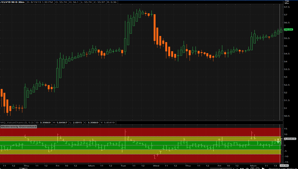
In thinkorswim, ValueCharts(R) appears as follows, with a light bar overlaying several colored bands.
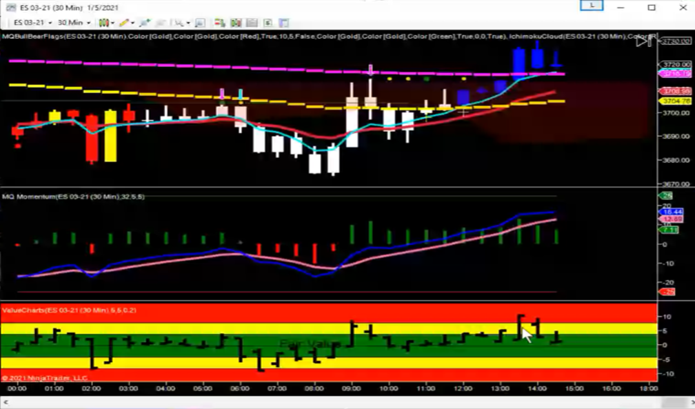
In NinjaTrader 7, ValueCharts(R) appears as follows, with black bars overlaid atop colored bands, which is similar to how it appears in thinkorswim.
In TradeStation, ValueCharts(R) appears without any colored bands, as the colors are drawn as part of the bars in the subpanel. It appears as follows:
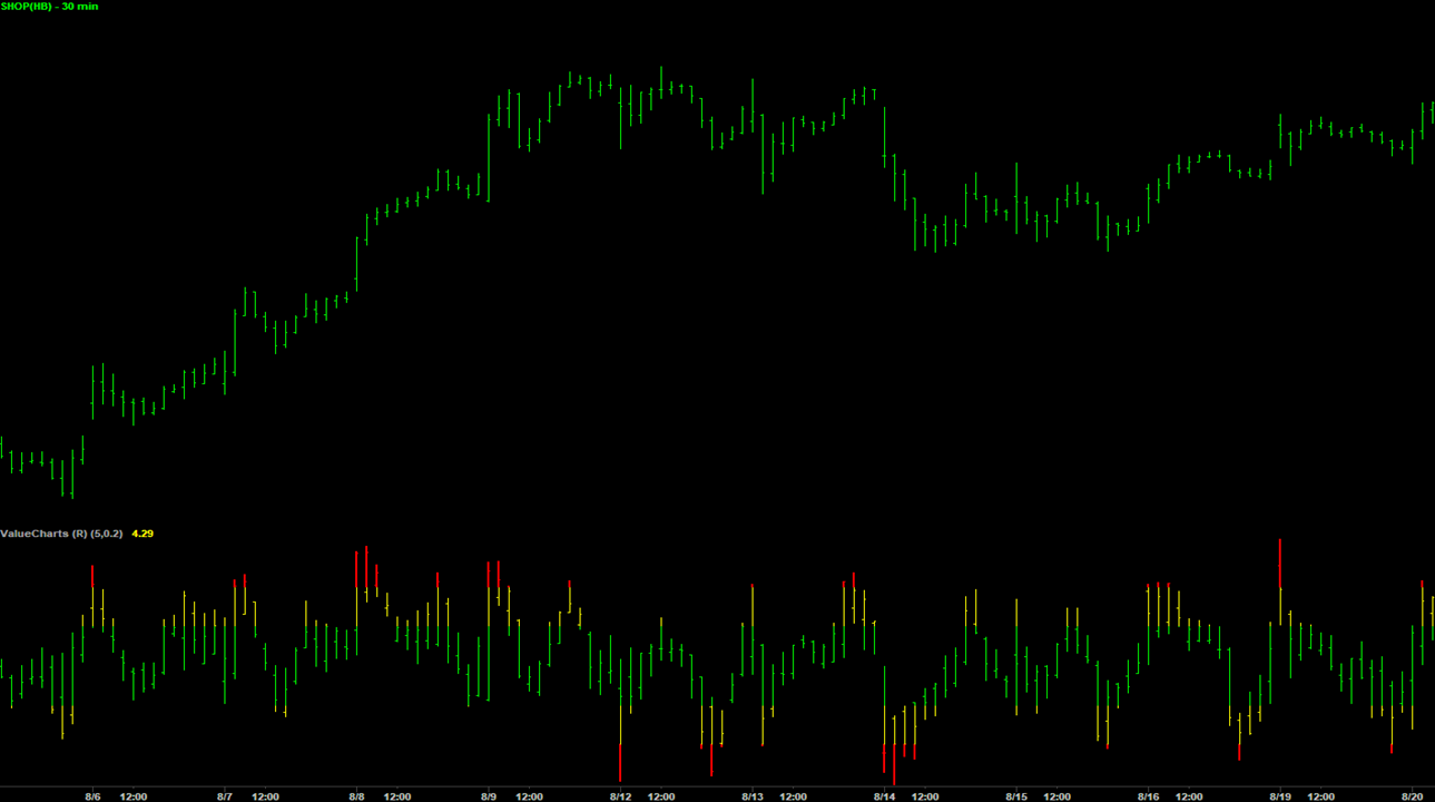
While these differences do look quite substantial at first glance, they are all representing similar data. And if you look at the TradeStation version, you'll notice that the red tops are all starting at the same point, as if there was a red band going across at that point, where the bars are red above that line. Same thing with the lower red, and with the other colors in the TradeStation version.
Similar information is being provided regardless of how the platform allows the information to be depicted, and they can all be traded and used the same way. After a short amount of use, it should be fairly easy to look at one drawing style vs another and see the same information depicted in whatever style it's presented.
Comments
0 comments
Article is closed for comments.